Wayfinding signs are directional signs that are designed to help people navigate and find their way around unfamiliar environments. These signs are typically used in large, complex spaces such as airports, shopping malls, hospitals, and universities, where people may become disoriented or lost.
At Wise Studios we have extensive experience in providing clear and consistent directional signage that benefits your organisation in a wide range of ways. An obvious one is the countless hours that can be consumed with your staff or clients being lost or uncertain what actions they need to take. A further benefit of this is how your staff and customers feel about your premises. They are much more likely to feel positive towards your location and not feel frustrated in their interaction with your business – which hopefully will reduce negative feedback and reviews.
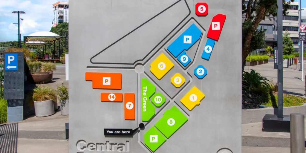
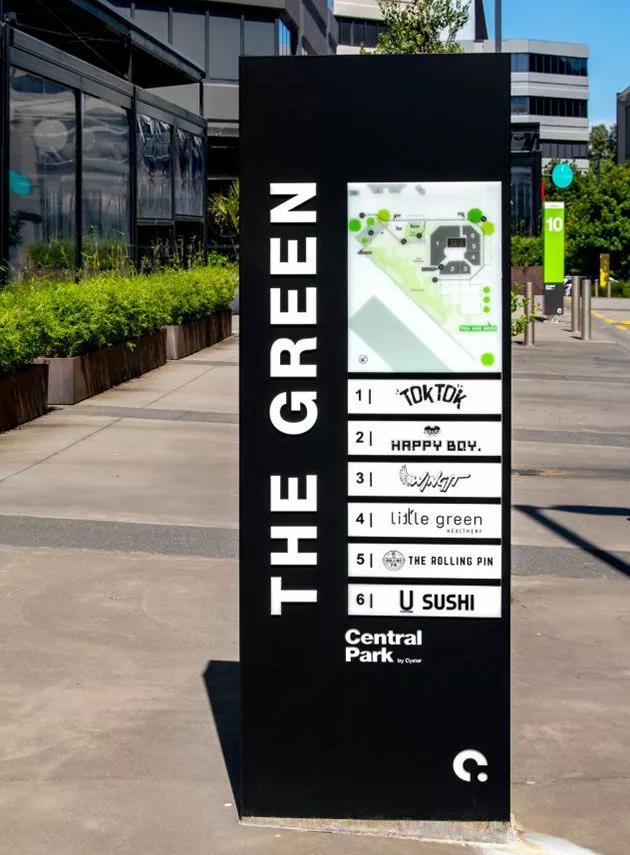
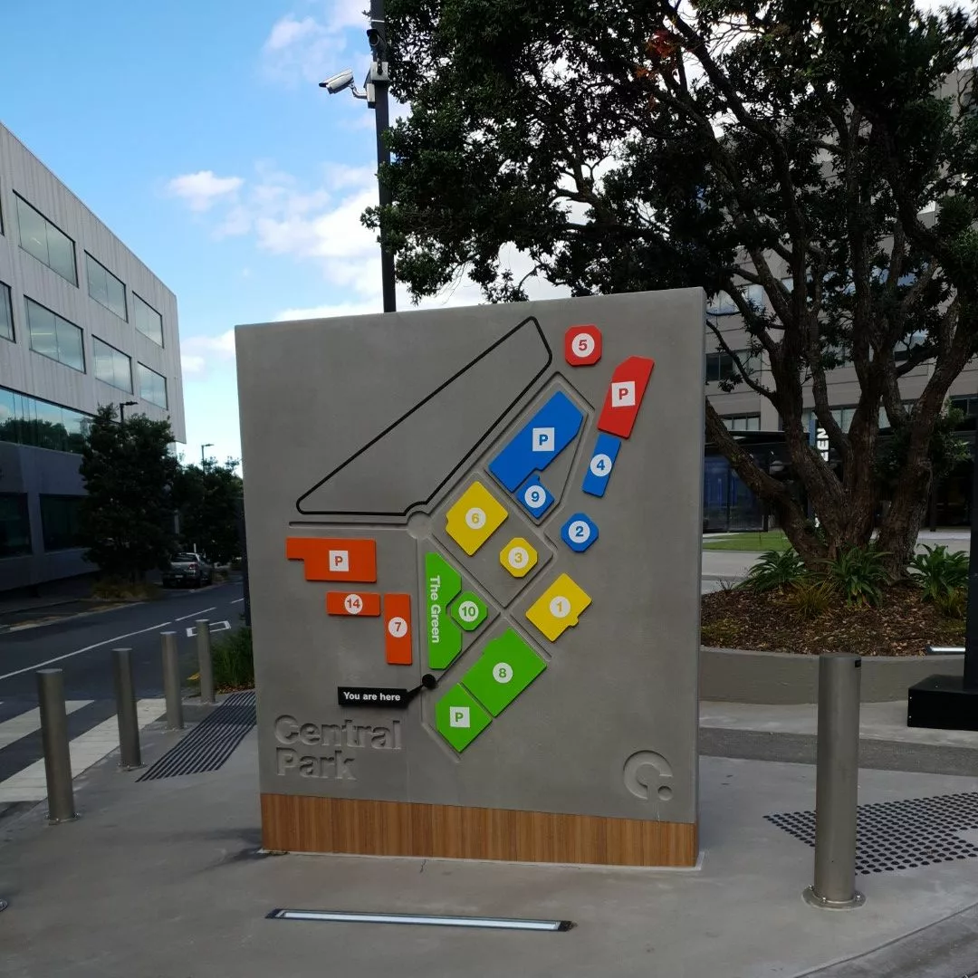
The purpose of wayfinding signage is to provide clear and concise information about the location of important landmarks and facilities, such as restrooms, exits, elevators, and parking areas. These signs may include arrows, symbols, and other visual cues that help people quickly and easily understand where they need to go.
Effective wayfinding signs are designed with a few key principles in mind. They should be easy to read and understand, with clear and concise wording and graphics. They should be placed in strategic locations, such as at intersections and decision points, to help people make informed choices about which directions to take. And they should be consistent in their design and messaging throughout the entire space, to ensure that people can navigate with ease and confidence.
Overall, wayfinding signs are an essential component of any large, complex space, and are critical for ensuring that people can find their way around safely and efficiently
A good wayfinding sign should be clear, concise, and easy to understand. Here are some specific elements that contribute to a good wayfinding sign:
- Visibility: A good wayfinding sign should be easily visible, even from a distance. It should stand out from its surroundings and be placed in a prominent location.
- Legibility: The text on a wayfinding sign should be easy to read. This means using a clear and legible font, appropriate size, and high contrast between the text and background.
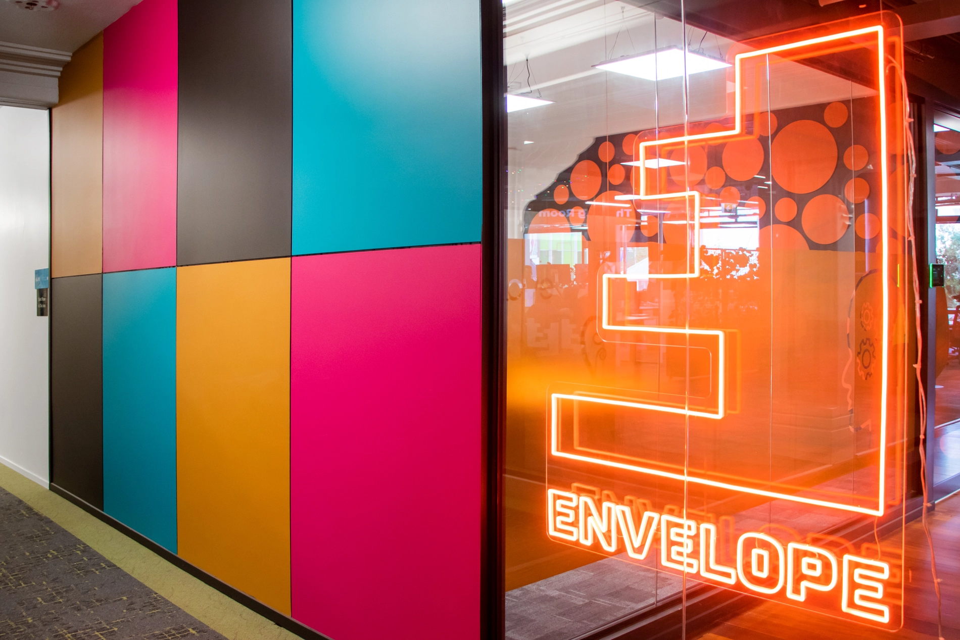
- Consistency: All wayfinding signs within a location should have a consistent design and layout. This makes it easier for people to recognize and follow the signage as well as subtly promoting your brand image.
- Directional arrows: Arrows can help direct people in the right direction and indicate the location of the destination.
- Simplicity: A good wayfinding sign should convey its message quickly and efficiently. The sign should not be cluttered with too much information or unnecessary details.
- Iconography: Including simple icons or symbols can help convey information quickly and easily, particularly for people who may not speak the language or have reading difficulties.
- Placement: Wayfinding signs should be placed at key decision points, such as intersections or changes in direction, to help guide visitors along their route and avoid the wrong place.
Overall, a good wayfinding sign should be designed with the user in mind, taking into account their needs and potential challenges they may face in navigating the environment.
There are several types of wayfinding signs that can be used to guide people through an environment:
- Directional signs: These signs provide directional information, such as indicating the location of a particular building, room, or facility. Directional signs may include arrows or maps to help guide people to their destination.
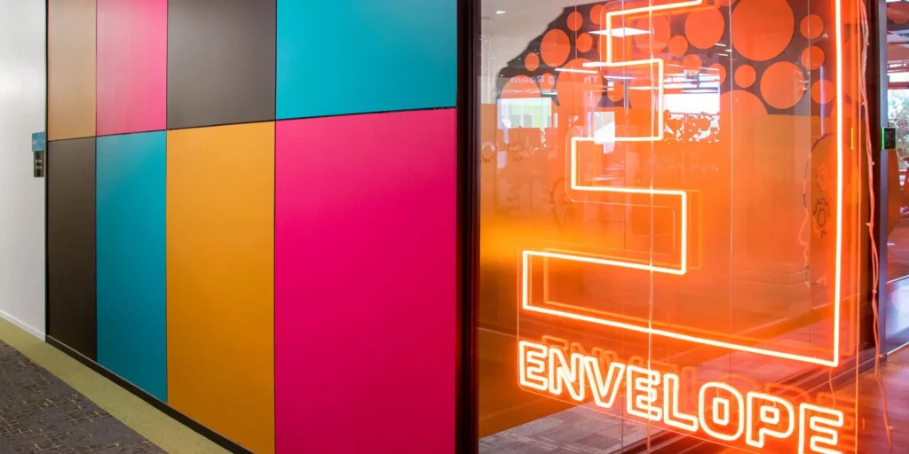
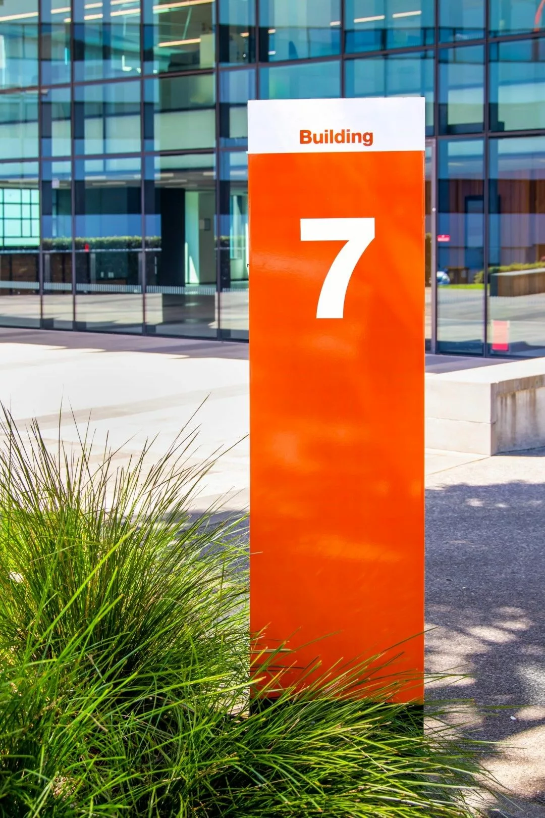
- Identification signs: These signs provide identifying information, such as the name of a building, room, or facility. They can also include logos, graphics, or other visual elements that help people recognize and remember the location.
- Regulatory signs: These signs provide information about rules or regulations, such as speed limits, parking restrictions, or safety hazards. Regulatory signs may also include warnings or cautionary messages.
- Informational signage: These signs provide general information, such as historical or cultural information, event schedules, or emergency procedures.
- Interactive signs: These signs use technology, such as touchscreens or QR codes, to provide interactive and personalized wayfinding information. Interactive signs can be particularly useful in large or complex environments.
- Braille and tactile signs: These signs are designed for people with visual impairments and include raised lettering and symbols that can be read through touch.
- Multilingual signs: These signs are designed to provide wayfinding information in multiple languages, making them accessible to people from diverse backgrounds.
Overall, the type of wayfinding sign used will depend on the specific needs of the environment and the people who will be using it. A well-designed wayfinding system may incorporate multiple types of signs to provide clear and effective guidance.
For directional signs, it’s important to use high-contrast colour combinations that make the information easy to read and understand quickly. Here are some color contrasts that work well for directional signs:
- Black and white: This classic colour combination provides high contrast and is easy to read, even from a distance. It’s a great option for signs with a lot of text. However, 95% is a better contrast for those with visual impairments (so dark grey on white.)
- Black and yellow: This combination is often used for warning or cautionary signs, but it can also work well for directional signs. The yellow adds a pop of colour and draws attention to the information. It is also the perfect colour combination for those with visual impairments.
- White and blue: This colour combination is often used for informational signs, such as those indicating the location of a restroom or elevator. The blue background is calming and easy to read against white text.
- White and green: This colour combination is often used for directional signs in outdoor environments, such as parks or hiking trails.
- Black and silver: This combination is often used for high-end or modern directional signs. The silver adds a sleek, sophisticated look to the sign.
It’s important to note that the colour combinations used for directional signs will also depend on the environment and the specific needs of the users. For example, a hospital may use different colour combinations than an amusement park. Ultimately, the goal is to choose colours that are easy to read and provide clear guidance to the use. They should also contrast with the background so that they can be easily seen.
Pictorials, or visual symbols, can be used with navigational signs to provide additional information that is easy to understand at a glance. Here are some reasons why pictorials should be used with navigational signs:
- Universal understanding: Pictorials can be easily understood by people from different cultural and language backgrounds, as they do not rely on written language. This makes them particularly useful in multicultural and multilingual environments.
- Quick recognition: Pictorials can be recognized quickly and easily, even from a distance or in low-light conditions. This can help users to orient themselves and navigate the site more quickly and efficiently.
- Reduced cognitive load: By using pictorials, navigational signs can convey information with fewer words, reducing the cognitive load for users. This can be particularly useful in busy or complex environments where users may be experiencing information overload.
- Greater accessibility: For people with reading difficulties or visual impairments, pictorials can make the information on navigational signs more accessible. This can improve their overall experience of the urban site.
- Consistency: By using consistent pictorials throughout the urban site, users can quickly and easily recognize key information and navigate the site more effectively.
Overall, incorporating pictorials into navigational signs can provide a range of benefits, including improved accessibility, reduced cognitive load, and greater efficiency and ease of use. When designing navigational signs, it’s important to consider the specific needs of the users and the environment to ensure that the pictorials used are appropriate and effective.
Contact us today to discuss your directional signage scheme


